Process
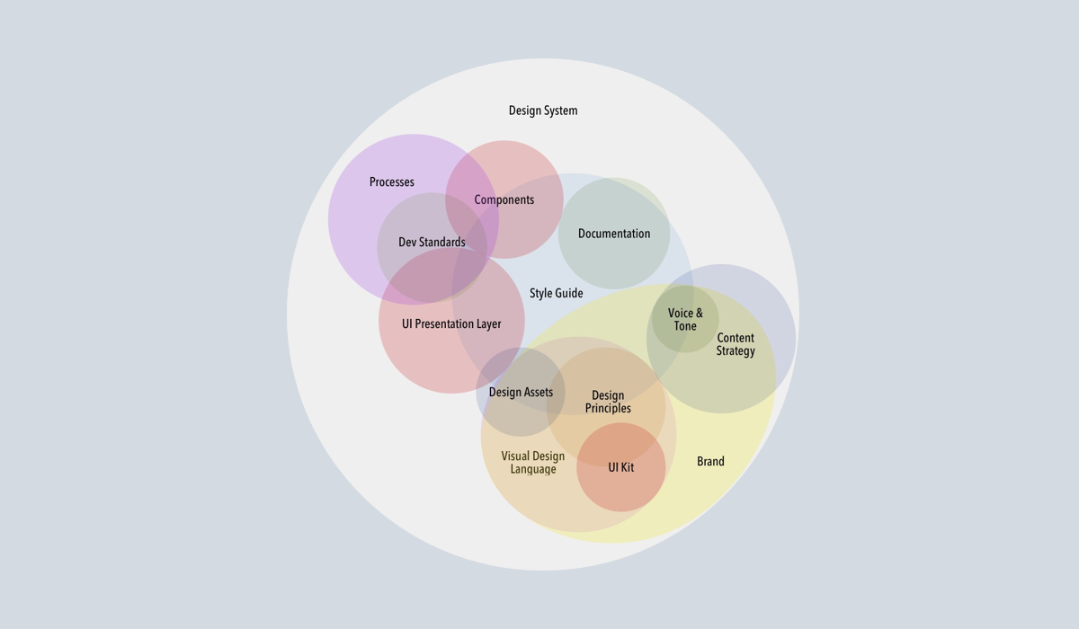
This article focuses on the decision-making process while actually analyzing design system components. Code snippets included in the portfolio were also limited to revealing decision reasons of “why implement this way” rather than implementation results. For example, explaining in detail the reasons for separating specific style differences as props rather than separate components, designing various style variations as variants, or the background for using design tokens indirectly rather than directly referencing them. For this purpose, I compared three design systems—Apple Human Interface Guidelines (HIG), Material-UI (MUI), and Coinbase Design System (CDS)—centering on common components like Button, Text Input, Modal, and the AreaChart component unique to CDS. While analyzing each component from design and code implementation perspectives, I organize in detail specific elements like design token utilization, variant structure, state composition, and accessibility handling methods. The analysis method classifies and describes content from perspectives of common structure, naming differences, and functional differences, like the classification proposed in the paper “Framework for Comparative Analysis of Usability of GUI Components by Mobile Operating System.” Finally, I organize lessons and learning effects gained through this comparative analysis process and present practical conclusions on implications for design-development collaboration.
3. Analysis Approach
Typification centers on component function name consistency, functional similarity, and structural differentiation. First, components were classified into three types. Primitives include basic interaction elements Button and Text Input, Overlay includes Modal overlaying on screen, and Crypto-specific includes Area Chart especially frequently used in crypto fields. For each component, the following items are compared:
- Design Specifications: Usage guidelines and visual recommendations for the component in official guidelines.
- Structure and Props: Component property (props) composition and substructure at code level. For example, reviewing variant provision methods, state management (supporting loading through props, etc.) and design token utilization.
- Name and Function Comparison: Comparing whether component names or concepts match in the three systems (e.g., identical as “Button”), whether provided functions are similar (e.g., disabling, loading state support, etc.), and whether there are differences in structure or usability (e.g., subcomponent composition, label handling methods, etc.).
- Customization Points: Examining the customization scope and methods allowed in each system, such as theme application or style extension.
In the comparison process, according to the paper’s methodology, function name consistency, degree of functional similarity, and differentiation in structure/usage patterns are tabulated for typification. Additionally, design intent and implementation choices of each design system are shown through code snippets. For example, excerpting and citing in analysis parts revealing decision-making such as reasons for introducing the variant concept or how to utilize design tokens in spacing handling.
Components
Primary Button
Design Guide Comparison
All three systems provide “Button” components as basic elements, but there are differences in detailed guidelines according to design philosophy.
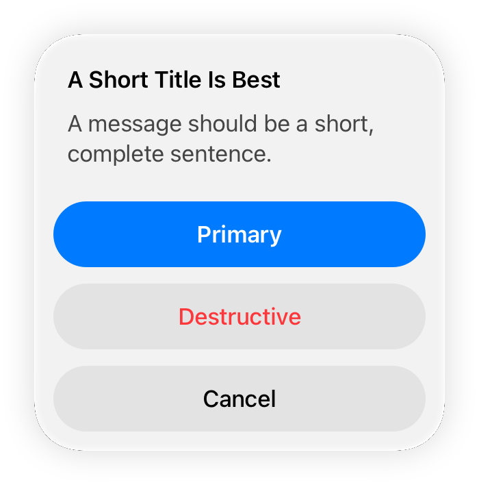
Apple HIG emphasizes intuitive touch areas and platform consistency. For example, recommending “buttons should have a minimum touch area of 44×44 pt (60×60 pt for visionOS)” to allow users to easily press. Additionally, in iOS, Primary action buttons are made prominent (using accent colors like default blue), and Destructive actions are indicated with red text to draw attention. Apple recommends following basic styles provided by the OS rather than heavily customizing button styles, and there are standard styles according to context, such as emphasizing confirmation (OK) buttons in bold in modal dialogs. While Apple HIG doesn’t directly mention transparent background buttons, in iOS there exists a pattern implemented as text-form buttons (link style) in Navigation Bars, etc.
In contrast, Material-UI (MUI) provides three button variants—Contained / Outlined / Text—according to Material Design principles to control visual emphasis level appropriate to context. The default “Contained” button has filled background color giving highest emphasis, “Outlined” has only an outline giving medium emphasis, and “Text” button has only text without background giving lowest emphasis. Additionally, MUI buttons can specify primary/secondary colors or error colors through the color prop, making Primary and Secondary role distinctions or Destructive (error color) styles easily implementable.

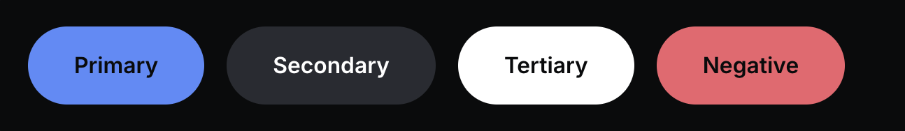
Coinbase CDS buttons similarly use variant props like MUI but explicitly provide four values: primary, secondary, tertiary, negative. Primary is for main actions within a screen (recommended only one per screen), Secondary for multiple equal actions, Tertiary for high-contrast on dark backgrounds, and Negative guides usage for irreversible destructive actions. Additionally, CDS separately has a transparent prop to apply “transparent background” style to any variant. Through this, Ghost button styles that lower button emphasis by one level are implemented (containers display only during interactions like hover), playing a similar role to MUI’s Text button.

Structure and State Implementation
Apple’s UIKit/SwiftUI buttons are relatively simple interfaces (UIButton or SwiftUI Button view), not providing functions like loading state or icon placement by default. If needed, developers must place Activity Indicators (spinners) on buttons or implement separately.
In contrast, MUI through extended button components made it easy to insert icons on both sides inside buttons through startIcon and endIcon props, and includes all basic functions like disabled prop and onClick event handlers.
While MUI itself doesn’t provide loading state props by default (a separate <LoadingButton> component exists in Lab), CDS standardized the pattern of supporting a loading boolean prop to disable buttons and show spinners when loading. For example, setting <Button loading={isLoading}> shows a loading spinner inside instead of button content, maintaining button width to prevent layout changes. This seems to reflect Coinbase’s practical experience (crypto UX with many waiting situations like transaction processing). Additionally, while all three systems provide disabled props (Apple in SwiftUI .disabled(true) modifier form), Coinbase CDS further supports compact prop (small size buttons), block prop (100% width expansion of parent container) to accommodate various layout situations.
MUI also provides similar functions through props like size="small|medium|large" and fullWidth prop. Meanwhile, Apple’s buttons specify sizes individually or follow system defaults, and iOS HIG only recommends layouts securing sufficient spacing and touch areas between buttons without detailed size variant concepts.
Name and Style Consistency/Differences
In naming, all three systems are unified as Button. Functionally, basics like click/tap actions and disabling are common. However, there are differences in style variant naming and concepts. Apple explains by roles like Primary action or Destructive action in official documents, and in SwiftUI implementation, specifying role like Button(role: .destructive) automatically applies red text style.
MUI classifies by expression method like variant=“contained/outlined/text” and additionally conveys meaning through color="primary|secondary|error|...".
In Coinbase CDS’s case, while referencing Material design, it adopted a design integrating meaning and style by directly exposing Primary/Secondary/Tertiary/Negative as variants. For example, giving variant="negative" in CDS sets button color to red, and CDS also reflects this in ARIA attributes to implicitly convey error role in terms of accessibility.
Additionally, unlike Apple, MUI and CDS also provide icon-only buttons separately (MUI <IconButton>, CDS <IconButton> components), recommending explicit use of that component if button content is only icons. In terms of accessibility, Apple uses button text as labels for voice reading, etc., and CDS also receives accessibilityLabel as a prop to specify alternative labels for icon-only buttons. MUI leaves it to developers to directly assign aria-label attributes or handle through <IconButton aria-label="...">.
Design Token Utilization and Customization
Apple HIG doesn’t have a “design token” concept exposed to developers, but system colors and fonts themselves can be considered a kind of token (e.g., using system colors corresponding to Light/Dark mode in iOS).
MUI handles palette colors, spacing units, etc., like tokens through its theme system, and can override component styles through sx props or styled API.
CDS is a system that fully fronts design token philosophy, defining all visual attributes (color, typography, spacing, radii, etc.) as tokens and applying them to components. For example, looking at CDS button CSS shows user theme values like var(--color-bg) or var(--spacing-2) being used, and Coinbase opened this as a Theming function allowing anyone to customize with their own brand colors, etc. While conceptually similar to MUI’s theme customization, Coinbase open-sourced the design system encouraging various crypto projects to utilize Coinbase-level UI components by just replacing tokens.
Looking at just the Button component, MUI provides palettes like primary(main #1976d2), secondary(main #9c27b0) following Material Design’s default color system, and CDS defaults to Coinbase’s unique branding colors but can batch change to other brand colors through token replacement. Thanks to such structural design, predicting design modification scope becomes easy. For example, changing Primary button color in Coinbase CDS is simply changing token values, so the impact of Primary button changes across the entire product can be easily predicted and managed.
Overlay Component: Modal (Dialog, Popover)
Design Guide Comparison
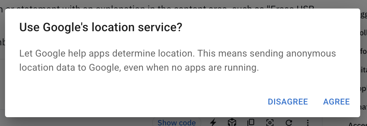
Modal is a UI pattern that appears overlaid on the current screen to focus user attention. Apple HIG guides with situation-specific terms like “modal view” or “sheet,” “alert” rather than directly using the “Modal” term. The core principle is to use Modal when having users perform self-contained tasks. For example, “when important auxiliary tasks or multi-step subtasks are needed, diverge from current flow providing modally, and return to original screen upon completion” is desirable.
Apple cites login screens or new item addition screens as such modal examples, emphasizing always placing cancel or completion buttons so users explicitly close. And in iPhone, since modals cover the entire screen, include navigation bar at top placing “Cancel”/“Done,” and in iPad they appear centered in formsheet form—platform-specific modal forms are also specified in HIG.
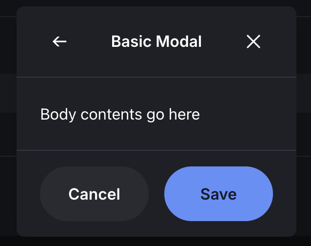
In Material Design too, the Modal concept is embodied as Dialog. According to Material guide, “Dialog appears on app content displaying important information or requiring decisions, blocking all other functions while appearing.” Additionally, it explicitly states “use only when necessary as it’s disruptive.” In MUI, it’s implemented as <Dialog> component, which internally utilizes <Modal> component. MUI guide states “to create modal dialogs, using Dialog is better than directly using Modal.” Dialog provides subcomponents of title (<DialogTitle>), body (<DialogContent>), and action button area (<DialogActions>) to establish consistent structure.
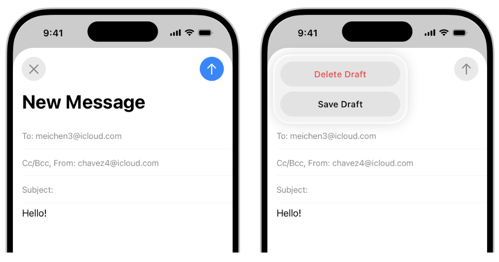
Coinbase CDS also structurally divided Modal components, configured to use with three parts: <ModalHeader>, <ModalBody>, <ModalFooter>. Additionally, CDS provides several variations like FullscreenModal, Alert, and Tray. FullscreenModal covers the entire screen on mobile (probably similar to Apple’s basic modal), Alert is a simple modal for warnings, and Tray appears to be a kind of bottom sheet rising from the bottom of the screen. This classification shows Coinbase’s design team segmenting Modal patterns across Web and Mobile. Apple also distinguishes two styles in UIAlertController: .alert (center popup) and .actionSheet (bottom slide), and CDS’s Alert and Tray align with this.
Structure and Functions
In Apple iOS, when calling modals, a new UIViewController is .present(...) to transition screens according to modalPresentationStyle. While there’s no separate Modal component object, UIKit imparts modal characteristics (e.g., previous screen is deactivated, new VC floats up). Developers just specify VC transition method and the iOS system provides dimming behind and screen transition animation (basically slide up from bottom).
MUI’s <Modal> component is very low-level, rendering children to body based on portals (React Portal), handling backdrop clicks or ESC key processing, and A11y functions like focus trap. <Dialog> is a high-level implementation adding various convenience functions (title, content scrolling, etc.) on top of this Modal. For example, MUI Dialog basically sets role=“dialog” and aria-labelledby, etc., and automates tabIndex management.
CDS Modal is also implemented as React Portal, opening and closing through isOpen prop, etc. Rather than just using <Modal>, CDS recommends the pattern of putting title and close (X) button in <ModalHeader>, content in <ModalBody>, and <Button>s in <ModalFooter>. This structure enforcement reduces developer mistakes and increases design consistency. Meanwhile, CDS designed to also enable page-unit navigation inside modals. For example, FullscreenModalLayout can include navigation bar components inside, allowing multiple steps within modals. Apple also mentions in HIG that “navigation hierarchy can be had inside modals,” acknowledging push/pop is possible within modals. However, it advises limiting to short flows if possible due to increased complexity. Coinbase CDS’s PortalProvider or OverlayContext hooks also exist, appearing to include advanced functions like handling context when multiple overlapping modals appear.
Name and Usability Comparison
In naming, Apple calls them situationally as “Alert,” “Action Sheet” rather than the “Modal” term, Material/MUI uses “Dialog,” and Coinbase collectively calls them “Modal.” In terms of usability, what’s commonly emphasized is necessarily making users take action to close.
Apple says cancel/confirm buttons are essential in modals, and MUI also gives examples of necessarily including close-related buttons in Dialog actions. Closing on backdrop click also differs—Apple’s modals (alerts) don’t close on backdrop touch requiring explicit action.
Web/MUI Dialog is set by default not to close on backdrop click (handling in onClose if needed), and Coinbase CDS also basically follows the principle of explicit user closing for Modals. However, CDS <Tray> (action sheet) can probably be closed on backdrop touch. Multiple simultaneous modal displays are avoided by all three systems, but are possible when needed (e.g., like Apple Contacts app with action sheet on modal, etc.).
MUI Modal allows nesting but doesn’t recommend overlapping more than two, and CDS can probably also use like displaying Alert on FullscreenModal. For animations, Apple provides by default (slide, etc.), MUI selectively applies Slide, Fade, etc., through Transition components, and CDS can also inject custom spring animations through Transition prop along with default Fade/Slide effects if needed.
Design Tokens and Customization
Coinbase CDS’s modals can control backdrop color transparency, modal background/corners, etc., with tokens to easily accommodate dark mode or themes. MUI also uses theme’s palette.background.paper for modal background, and radius can also be theme overridden. Apple follows modal shapes determined by the system (especially alert style is rounded corner rectangle) with almost no room for change. However, after iOS13, modal display styles can select .automatic/ pageSheet/ formSheet/ fullScreen allowing use of default forms by device or forced specification. Overall insights gained from Overlay/Modal component comparison are that web design systems carefully define Modal’s structure and utilization to increase development convenience and consistency, while platform guides (HIG) focus on Modal’s usage scenarios and UX principles. Both approaches share the commonality of prioritizing not overusing modals and using them appropriately to context so as not to harm user experience.
Crypto-specific Component: Area Chart
Introduction Background
Area Chart isn’t in general UI libraries but is core-used in crypto services for price trend visualization, etc. Among this comparison’s subjects, only Coinbase CDS provides AreaChart components at design system level, showing domain-specialized component design cases. While Apple HIG or Material Design also have general guidance on “charts,” they don’t provide specific implementation components. Apple introduced APIs (BarMark, LineMark, AreaMark, etc.) to draw various charts through SwiftUI Charts framework from iOS 16, but this is a development framework to the end and isn’t considered a “design system component” at HIG level. Material-UI also doesn’t have charts in basic configuration, providing a Charts library as a separate package called MUI X. MUI X Charts is D3-based React componentization of Bar, Line, Pie, etc., with Area Chart being implemented by giving fill area as an attribute to LineChart component. While Coinbase CDS may have wrapped AreaChart utilizing Recharts internally, the important point is defining props API and documentation from a design system perspective.
Design Guide Comparison
Apple HIG’s “Charting Data” section advises clearly conveying data’s core when using charts and not confusing with too much information. For example, giving best practices like “charts are visually prominent so should focus on important information users will be interested in,” “keep charts as simple as possible and let users drill down for additional details when they want.” Material Design also has separate guides to consider color, label readability, and accessibility during interaction (e.g., ARIA descriptions) in data visualization. However, these are at design principle level, without specific component specs like “Area Charts should be drawn this way.”
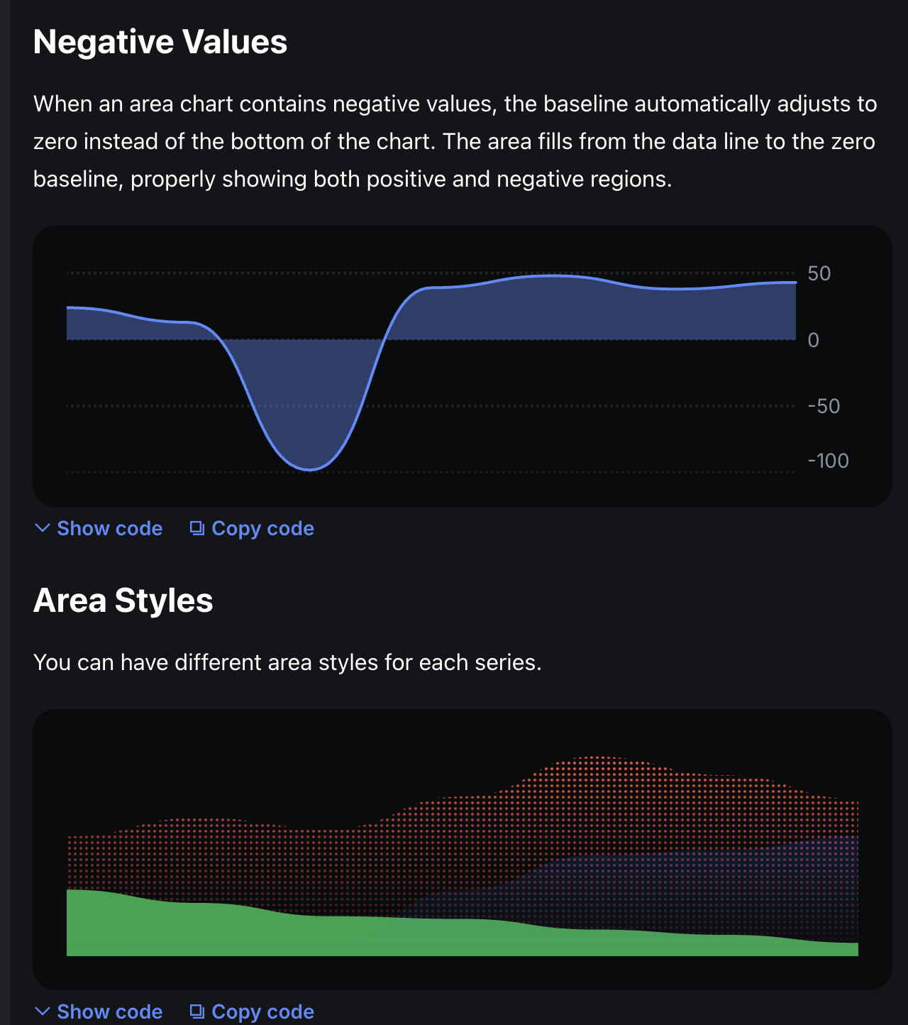
Coinbase CDS created AreaChart components to maintain consistent chart styles across their services. Design-wise, Coinbase charts generally have rules of displaying rises in blue/green series and falls/negatives in red. CDS AreaChart basically follows these rules, automatically adjusting baseline to 0 when negative data is included to separately display shading. Additionally, when overlapping multiple series in charts, transparency or gradients are used to increase readability. Coinbase’s design team included even chart animation effects and interactions (Marker, Scrubber) in the design system—for example, lines gradually drawing when charts load or real-time animation according to value changes are also configurable. This is detail not covered in general UI guides, showing how much Coinbase considered design optimized for crypto UX.
Structure and Props
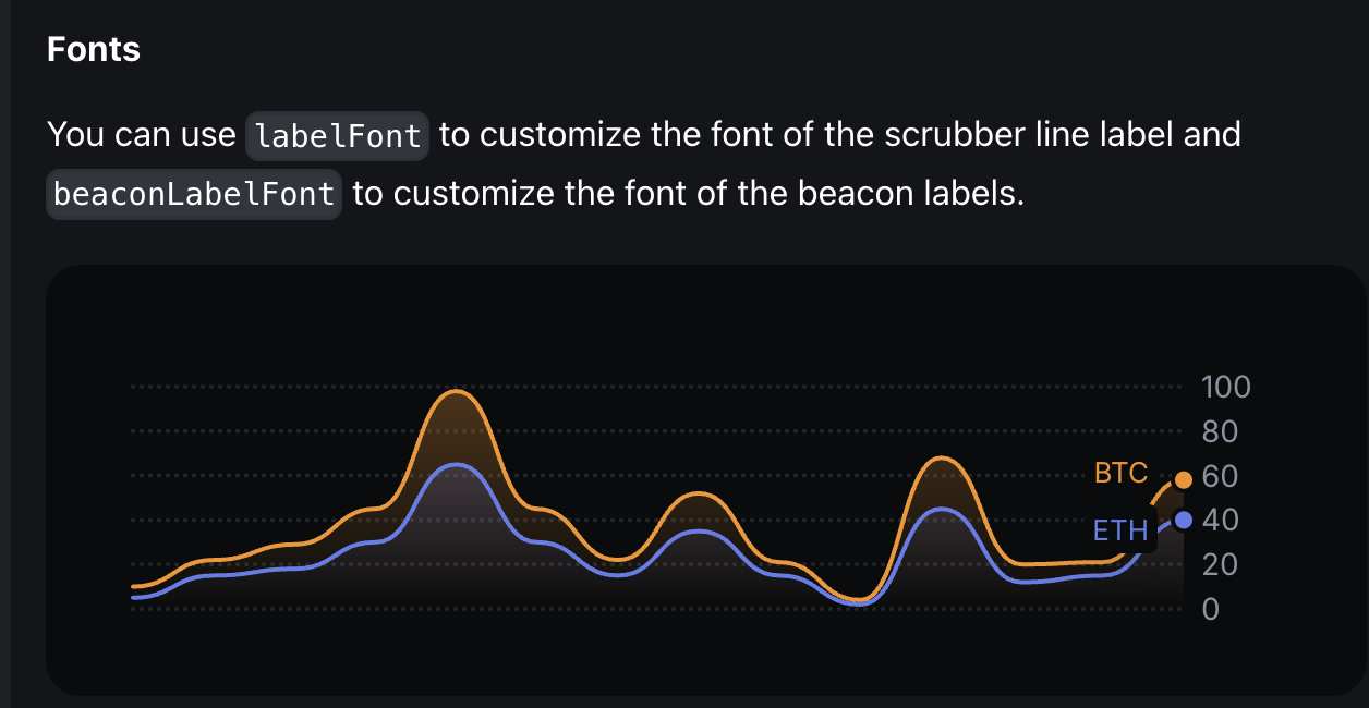
Looking at Coinbase CDS AreaChart’s props, there are data series arrays and each series’s attributes (id, data array, color, etc.), height and inset (chart internal margins), showLines (whether to show line outlines), showYAxis/XAxis for axis display, stacked and stackId (stack group distinction) among options for expressing multiple series together. Particularly, styles for area filling or line shape can be changed by specifying 'gradient', 'dotted' through type prop, and AreaComponent or LineComponent can be injected as customization props making it extremely flexible. For example, to draw dotted line charts, custom components like LineComponent: DottedLine can be passed to replace lines. Animation-related, passing values like { type: 'spring', stiffness: 700, damping: 20 } to transition prop allows adjusting chart appearance/update animations. Additionally, animations can be turned off with animate={false}.
Overall, CDS’s chart components provide complete APIs that intermediate developers or data visualization personnel can utilize immediately. For MUI X Charts’ corresponding item LineChart+Area field, it’s used like <LineChart series={[{data: [...] }]} xAxis={[...]} /> and MUI X also takes composition approach (ChartContainer, ChartAxis, etc.). However, MUI X Charts is still divided into community version/pro version so not all functions are free. When using Apple’s SwiftUI Charts AreaMark, it’s declarative syntax like Chart(data) { AreaMark(x: .value(...), y: .value(...)) } but fine shape control must be handled with modifiers and low-level customization is difficult.
Name and Function Comparison
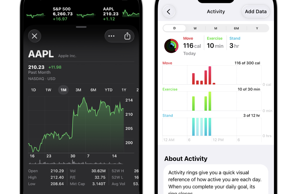
In naming, while Coinbase clearly componentized as AreaChart, other systems don’t have special names. Material guides don’t separately classify area charts but view them as a form of line charts. Apple also doesn’t distinguish area charts/line charts but only recommends chart selection according to data type or user purpose. Function-wise, as domain-specialized, CDS AreaChart doesn’t have legends or tooltips but separately provides components like PeriodSelector, Scrubber, and axes (XAxis, YAxis). For example, period toggles like 1D/1W/1M/1Y under Coinbase app’s price charts are implemented with PeriodSelector, and Scrubber shows values at that point when sliding fingers over graphs. Including these components in the design system ensures consistent interaction experiences. MUI X also has Tooltip and Legend modules applicable to charts, but doesn’t provide Period selectors or scrubbers as they’re not universal UI. Apple only presents philosophy like “encourage users to explore” for chart interaction, leaving implementation to individual apps.
Design Tokens and Customization
CDS charts manage colors with design tokens, so changing themes automatically links chart color palettes. In the above example, using tokens like color: 'var(--color-fgPositive)' made rises use the theme’s positive color. MUI X uses MUI theme colors as is or specifies colors directly.
Apple doesn’t automatically generate chart colors so developers must determine Color sets, but Apple chart basic color palettes (iOS chart framework default provided colors) exist implicitly following recommendations. In terms of customization, CDS AreaChart is open enough to inject arbitrary React components through AreaComponent prop to replace rendering. This accommodates various demands like displaying only specific sections with unique graphics or laying patterns on area colors. In contrast, MUI X or Apple Charts didn’t document such levels of extensibility (though possible through source modification or SwiftUI View composition, it’s outside support scope).