Problem Statement
Recently, the iPhone’s color picker mode has added a new option called “HDR Boost” in addition to the existing RGB. Beyond this, concepts such as color gamuts like sRGB, Display P3, and DCI-P3 frequently appear, yet many people use them without clearly understanding the conceptual differences. Specifically, the questions I had while working on design were as follows:
- The iPhone’s color picker mode recently added something called HDR Boost in addition to RGB — what is it?
- There are also many color spaces — sRGB, Display P3, DCI-P3, wide color gamut, color reproduction specification graphs, etc. — and it would be good to understand them before using them.
- In CSS, there are many color notation methods beyond rgba and hex, such as hsl and oklch, and I wanted to understand the differences in their intended use.
- In Adobe Illustrator, when selecting HSB and the “Only Web Colors” option, the color gamut simplifies as shown in the image below — I was curious why this happens.
Whenever I studied color in the past, I always encountered materials heavily focused on color psychology. This time, I intend to take a scientific approach that can answer these questions. Ultimately, I aim to organize color-related terminology and technical concepts based on this background.
1. Building a Terminology Map
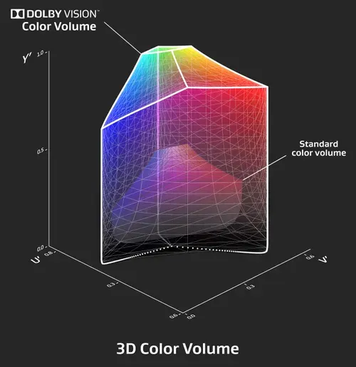
1.1 3D Color Volume
1.2 Color Model vs Color Space
The frameworks used to represent color digitally are broadly divided into Color Models and Color Spaces. A color model is the mathematical structure that describes color, while a color space can be understood as an implementation of a color model optimized for a specific device or environment. (However, the two terms are often used interchangeably.)
(1) RGB
The most widely used RGB color space is a model that expresses a variety of colors by combining three primary colors: Red (R), Green (G), and Blue (B). It is the default for most digital devices including monitors, web, and mobile displays, and conversion between RGB and XYZ is possible through linear matrix transformation.
Advantages: Intuitive and simple to implement; adopted as the default in most digital imaging and UI systems. Disadvantages: Difficult to apply directly to image processing algorithms and unfavorable for complex computations. It is particularly unsuitable for luminance-based grayscale conversion or binarization.
For example, when converting an RGB image to grayscale, weights reflecting human visual characteristics are applied. These weights exist because humans are most sensitive to green and least sensitive to blue. Thanks to these weights, grayscale conversion can be performed while preserving visual perception as much as possible.
NTSC standard conversion formula:
Brightness = 0.2999R + 0.587G + 0.114B

Simple average formula:
Brightness = 0.333R + 0.333G + 0.333B
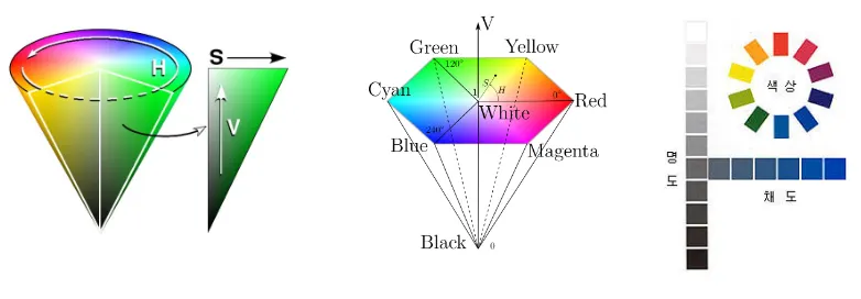
(2) HSL / HSV
The HSL (Hue, Saturation, Lightness) and HSV (Hue, Saturation, Value) color spaces are variants of the RGB model, created to provide users with more intuitive controls. They are frequently used in digital design tools and image processing.
- Hue: Represents the type of color, expressed as an angle in the range of 0-360 degrees on the color wheel.
- Saturation: Represents the vividness or intensity of a color, with a range of 0.0 to 1.0.
- Lightness / Value: The component that represents brightness, functioning similarly to the amount of illumination.
The key advantage of this model is that it allows ’luminance (brightness)’ information to be handled separately from hue and saturation. This makes various hue adjustments and tonal corrections easier to perform.
(3) YCbCr / YUV
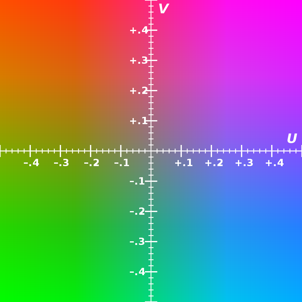
Components Y (Luminance / Brightness): Responsible for the overall tonal structure of an image, it is the most visually important element. In most cases, it is allocated 4 or more bits and stored with high precision. Traditionally, the luminance component is denoted as Y, a naming convention that dates back to the era of black-and-white video signals.
Cb (or U): Chroma Blue: A component representing the difference between blue and luminance information. It is defined by the formula Cb = (B - Y) * K1, where K1 is a coefficient determined by the standard. Under the BT.601 standard, K1 = 0.49211. Since this component contains information to which human vision is relatively insensitive, it is typically stored at a lower precision of about 2 bits.
Cr (or V): Chroma Red: A component representing the difference between red and luminance information. The formula is Cr = (R - Y) * K2, where K2 = 0.877283 (BT.601 standard). As this is also chrominance information, it can be encoded with a low number of bits.
Usage and Differences YCbCr: A color space for digital encoding, widely used in digital video compression formats such as JPEG images and MPEG video compression. It was designed for bit efficiency and encoding optimization, and is adopted as the default color space in most digital cameras and video codecs.
YUV: An analog signal-based color space used in analog TV transmission methods such as PAL (Phase Alternating Line) and NTSC. Today it has largely been replaced by YCbCr, but in analog broadcasting systems, the related concepts are still in use.
(4) CMY
CMY (Cyan, Magenta, Yellow) is a color space primarily used in printing systems. It has a complementary relationship with RGB, and conversion between the two is straightforward. Thanks to this relationship, it is useful for digital-to-print conversion. In practice, the CMYK model, which adds Black (K), is commonly used.
RGB to CMY conversion:
C = 1 – R, M = 1 – G, Y = 1 – B

CMY to RGB conversion:
R = 1 – C, G = 1 – M, B = 1 – Y
(5) ICC Profile
3. Other Key Concepts
- White Point (e.g., D65): The reference white point. D65 is generally based on standard daylight, and many displays and color spaces use it.
- Transfer Function (Gamma, PQ, etc.): Defines the relationship between digital values and actual brightness. SDR uses gamma curves, while HDR uses PQ (EOTF), among others.
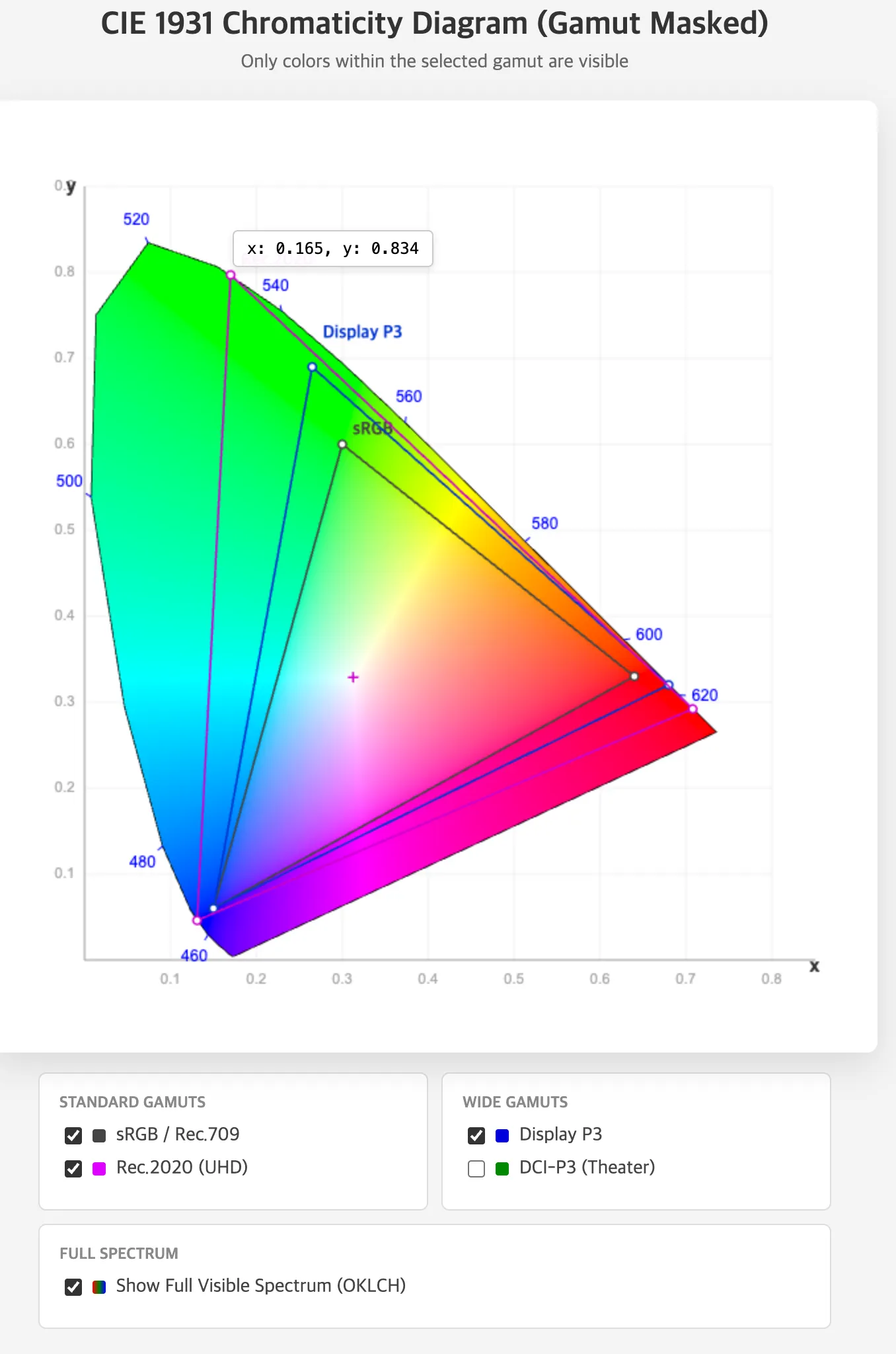
4. Gamut Comparison
A gamut refers to the range of colors that a specific color space can represent. It is typically visualized as a triangular region on the CIE xy chromaticity diagram. The following table compares gamut use cases. A detailed explanation of gamuts will be covered in the next installment.
| Color Space | Gamut Size | Definition and Usage | Advantages | Disadvantages and Notes |
|---|---|---|---|---|
| sRGB | Basic/Narrow | Default for web and UI design | Best compatibility | Cannot express wide gamut colors; risk of color distortion |
| Rec.709 | Similar to sRGB | SDR video standard | Standard for video editing | Similar to sRGB but be careful not to confuse the two |
| DCI-P3 | Wide | For digital cinema | Accurate cinematic color reproduction | White point differences; unsuitable for UI |
| Display P3 | Based on DCI-P3 with D65 | Optimized for the Apple ecosystem | Rich color expression | Potential errors in sRGB-based environments |
| Rec.2020 | Widest | HDR/UHD standard | Excellent future compatibility | Unsupported by most current displays |
5. iPhone’s HDR Boost Feature
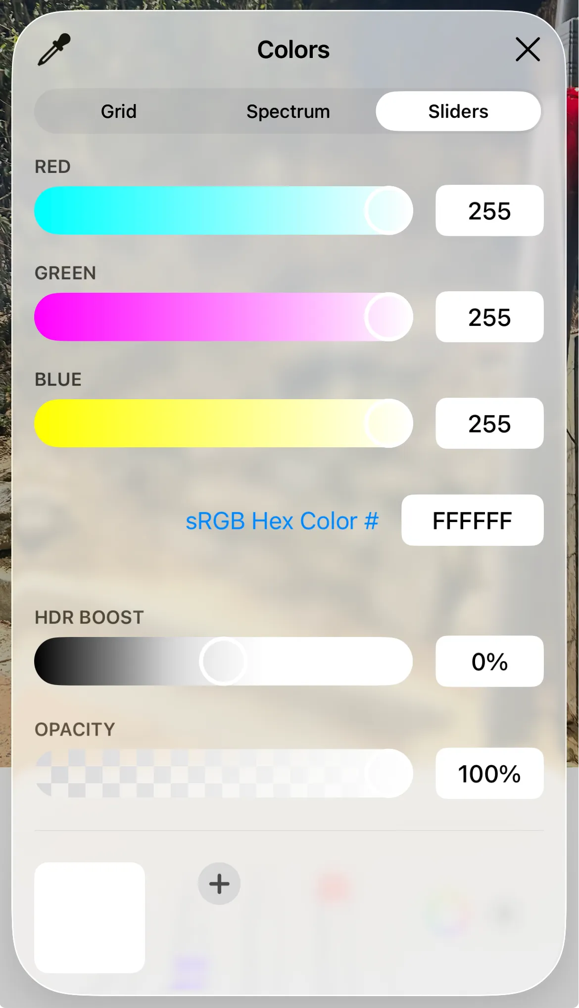
However, these effects vary depending on the display’s actual brightness performance, ambient lighting conditions, and the tone mapping applied by the system rendering layer in macOS or iOS, so consistent results are not always guaranteed.
6. Why Illustrator’s HSB and “Only Web Colors” Simplify the Color Gamut
From the 1990s through the early 2000s, many displays and graphics cards in the early web era had limited color output capabilities, able to render only 256 colors at a time. On top of this, the operating system itself reserved some of these colors for system UI components (e.g., windows, menus, buttons), so the number of colors actually available to users or designers was even fewer.
In such environments where the number of representable colors was limited, it was common for a display device to be unable to accurately show a specific RGB color chosen by a designer, forcibly converting it to the nearest available color through dithering. This caused persistent issues where image colors would blur, or patterns and background gradients would display differently from what was intended.
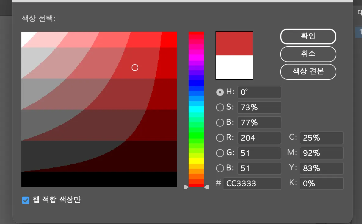
The 216-Color Safe Palette
The concept created to solve this problem was Web Safe Colors, or the 216-color safe palette. This palette consists of colors that could be reliably rendered on most systems even in 256-color environments, constructed by limiting each RGB channel value to 6 levels (00, 33, 66, 99, CC, FF). In hexadecimal terms, this is a uniform division of values from 0x00 to 0xFF in increments of 51 (255 / 5 = 51).
Under this scheme, the possible combinations are R x G x B = 6 x 6 x 6 = 216 colors, and these colors could be displayed reliably without dithering in virtually all environments regardless of display device limitations. As a result, these 216 colors came to be known as “Web Safe” colors.
The Experience in Color Pickers and Visual Discontinuity
In a typical digital color picker environment, when the user adjusts Hue, the color changes smoothly and continuously, and adjustments to Saturation and Brightness are also finely controllable. However, when the “Web Safe Colors Only” option is enabled, the situation is different. This mode forces the color the user is trying to select to snap in real time to the nearest of the 216 available colors.
As a result, colors that should move continuously instead appear as stepped blocks, in certain ranges multiple colors collapse into the same value, and subtle movements in color adjustment seem to produce no response at all — creating a visual discontinuity.
For example, even when a user intends to use a subtle midtone like #5A7FBC, in Web Safe mode it is automatically corrected and displayed as one of the restricted values such as #6699CC or #3366CC. Therefore, even a small movement of the mouse cursor in the color picker causes the color to appear to jump abruptly rather than changing smoothly.
References
- https://jlongster.com/why-chromaticity-shape
- https://dsaint31.me/mkdocs_site/DIP/cv2/ch02/dip_cv_color_space/#ycbcr
- http://www.ktword.co.kr/test/view/view.php?m_temp1=4710&id=98
- https://dsaint31.tistory.com/348
- https://cielab.xyz/pdf/cie.15.2004%20colorimetry.pdf
- https://news.samsungdisplay.com/14129
- https://developer.apple.com/videos/play/wwdc2024/10177