Table of Contents
- Introduction: Why Analyze Design Systems First? Why Choose Coinbase Design System?
- Main Content: Identity and Target Users
- System’s Official Mission / Slogan
- CDS, MUI, HIG Comparative Analysis
- System Architecture
- Notable Sections in Get Started: Theming
- Components
- Hooks
- Design Token Structure
- Combination of Primitive and Semantic Tokens
- Token Application Beyond Color
- Shadow Structure
- Conclusion
Introduction: Why Analyze Design Systems First? Why Choose Coinbase Design System?
I have long pondered how to contribute to the crypto ecosystem as a designer rather than a developer. Rather than remaining in the role of designing screens, the more important question became at what points in the overall process of creating and expanding products I could intervene. In this process, my interest naturally shifted toward design system construction methods that connect from token units to components.
Based on design, I’ve recently been building websites directly, learning development alongside. In this process, concerns about how designers and frontend developers should communicate to minimize collaboration resources became concrete. Particularly as we entered the AI era, discussions that tools like Cursor, Antigravity, and CLI could replace the roles of designers and frontend developers accelerated these concerns. Comparing before and after AI popularization, I clearly felt the nature of work I was assigned had changed. If in the past I mainly performed ‘making things pretty’ design work as main or freelance work, recently with AI and templates becoming universal across almost all fields, I came to feel that role alone wasn’t sufficient. Instead, based on practical experience and real-world sensibility, I got the impression that designers are required who can explain and demonstrate aesthetic judgment and its basis in actual situations. What operates importantly in practice was understanding how work flows between people rather than deliverables. I felt designers were needed who know efficient processes and experientially understand what becomes bottlenecks in collaboration. To use designer’s language as an analogy, just as during undergraduate years you could only survive in the workplace by becoming someone needed when you could finish work at print shops with almost no repeated modifications and scolding.
Until now, working in startup environments, systematically organizing design systems often felt like over-engineering. In situations requiring quick results, solving individual problems was priority. However, from my current position preparing for job changes, my judgment changed. I came to think the most basic judgment basis for design and frontend collaboration is ultimately the design system. Furthermore, the fact that this was documented and published seemed to be a result of considering not just internal efficiency but also the usage patterns of potential users and developers together. For these reasons, among published design system documents, I chose to analyze Coinbase Design System’s documentation as a representative case of the crypto industry! This overview aims for a trilogy continuing to design-development content.
Main Content: Identity and Target Users
- System’s Official Mission / Slogan
CDS presents the following key features in its Introduction.
For comparison, I’ve brought the first pages of MUI and HIG documents.
| CDS | MUI | HIG | |
|---|---|---|---|
| Provider | Coinbase | Apple | |
| Key Features | • Cross-platform - CDS provides components for both React DOM and React Native. We go to great lengths to ensure that the source code is as identical as possible across React and React Native without compromising on platform-specific features. • Powerful theming - The ThemeProvider can be used to define a custom theme for your application supporting light and dark mode. • Rich styling capabilities - Components are designed to integrate with third-party libraries like styled-components, and to be customizable via theming, props, StyleProps, classnames, and inline styles. • Subcomponent composition - Components are built using smaller subcomponents that can be fully customized or replaced via props. • Accessibility - Components are accessible out of the box, and can be customized to different accessibility standards. |
Ship faster: Over 2,500 open-source contributors have poured countless hours into these components. Focus on your core business logic instead of reinventing the wheel—we’ve got your UI covered. Beautiful by default: We’re meticulous about our implementation of Material Design, ensuring that every Material UI component meets the highest standards of form and function, but diverge from the official spec where necessary to provide multiple great options. Customizability: The library includes an extensive set of intuitive customizability features. The templates in our store demonstrate how far you can go with customization. Cross-team collaboration: Material UI’s intuitive developer experience reduces the barrier to entry for back-end developers and less technical designers, empowering teams to collaborate more effectively. The design kits streamline your workflow and boost consistency between designers and developers. Trusted by thousands of organizations: Material UI has the largest UI community in the React ecosystem. It’s almost as old as React itself—its history stretches back to 2014—and we’re in this for the long haul. You can count on the community’s support for years to come (for example Stack Overflow). |
Hierarchy Establish a clear visual hierarchy where controls and interface elements elevate and distinguish the content beneath them. Harmony Align with the concentric design of the hardware and software to create harmony between interface elements, system experiences, and devices. Consistency Adopt platform conventions to maintain a consistent design that continuously adapts across window sizes and displays. |
CDS
A practical design system that achieves both UX consistency and development efficiency for large-scale product suites through source code consistency, powerful theme system, and high scalability allowing subcomponent replacement—a cross-platform (React·React Native) component system verified in real financial products.
Like other design systems, it specified component composition structure and cross-platform support, among which its relatively technology-centric character stood out. In detailed descriptions, it directly mentions concepts like props and ThemeProvider, revealing intent to convey even code-level context within design documentation.
Perhaps due to its origins in crypto trading exchanges, I got the impression it prioritizes unique functionality and its implementation methods over visual completion. The design system operates as a tool for accurately implementing product core functions rather than as a UI guide.
→ It set frontend developers who need to operate and scale financial products in production environments, and design system owners as primary readers. It presupposed a practice-centered user base that values function implementation and code consistency over design guides.
MUI
A universal React UI library based on Material Design that supports rapid development and cross-team collaboration through a vast open-source community and high customization freedom, serving as standard UI infrastructure immediately applicable to various projects.
MUI fronted trust built internally and externally within organizations through expressions like “Collaboration, trusted by thousands of organizations.” Not just the system’s own completeness, but the fact that it’s already used by many teams and organizations operated as a persuasion logic.
At the point where CDS develops explanations centered on functionality and source code, MUI hinted at both visual convenience and selection flexibility through the sentence “diverge where necessary to provide multiple options.” The attitude of leaving room for different choices depending on situations rather than presenting one answer was impressive.
→ It targeted development teams and product teams of various scales requiring rapid development and collaboration. It presupposed a user base valuing selection flexibility and social validation over clear norms.
HIG
A design principle document applied across Apple platforms, presenting abstract yet powerful standards centered on hierarchy, harmony, and consistency—a philosophical framework that becomes designers’ and developers’ thinking reference point when designing interfaces.
HIG was the shortest in volume among the three systems. Whether due to Apple’s confidence or characteristics of OS-based design systems, I’m uncertain. Explanations were concise, but design philosophy revealed most clearly.
Particularly impressive was centering on the concept of Harmony, a term mainly used when explaining formative principles. The attitude valuing visual hierarchy and order also read clearly. While stating it follows platform conventions, looking at recent flows massively introducing glassmorphism, it appeared as the most unconventional choice among the three systems.
→ It placed designers and developers who need to make design decisions on Apple platforms as primary readers. It presupposed a skilled user base requiring thinking standards and design philosophy over implementation guidelines.
3. System Architecture
The introduction was long. Now begins full structural analysis centered on Coinbase Design System. Coinbase Design System’s overall structure divides into three main areas. Composed of Get Started, Components, and Hooks, with further subdivided classifications within Components, but due to space only top-level structure is organized.
design-system/
├── get-started/
│ ├── introduction/
│ ├── installation/
│ ├── templates/
│ ├── theming/
│ ├── styling/
│ ├── playground/
│ └── ai-overview/
│
├── components/
│ ├── layout/
│ ├── typography/
│ ├── inputs/
│ ├── media/
│ ├── cards/
│ ├── data-display/
│ ├── feedback/
│ ├── overlay/
│ ├── navigation/
│ ├── graphs/
│ ├── numbers/
│ ├── animation/
│ └── other/
│
└── hooks/
├── useBreakpoints/
├── useDimensions/
├── useEventHandler/
├── useHasMounted/
├── useIsomorphicEffect/
├── useMediaQuery/
├── useMergeRefs/
├── usePreviousValue/
├── useRefMap/
├── useScrollBlocker/
├── useTheme/
└── useOverlayContentContext/
Notable Sections in Get Started: Theming
Among Get Started sections, Theming is the area defining the design system’s foundation. Types and specifications of basic units composing interfaces like Color, Spacing, Border Radius, Icon Size, Avatar Size, Font Family·Size·Weight, Shadow are organized here. It’s a structure that presents standards applied across the system before individual components.
Components
Components is the system’s core area organized around UI assembly units. It organizes each component’s specifications to manage repeatedly used interface elements under consistent rules. This composition is commonly seen in other design systems, and personally I prefer direction similar to Radix UI.
However, a disappointing point is that accessibility standards don’t explicitly appear in the table of contents structure. In Radix UI’s case, accessibility is a core value, repeatedly addressing ARIA, focus management, and keyboard interaction throughout documentation. In contrast, CDS doesn’t present accessibility-related concepts as independent categories or clear entry points.
Hooks
Hooks handle the logic layer dealing with behavior and state rather than UI elements. Since this area will be addressed in a separate part after organizing the learning process, here I focus on structural meaning.
Intent to treat the design system as a framework unit rather than a UI kit by separating UI and logic reads clearly. This acts as a clear advantage in terms of implementation efficiency and development speed.
4. Design Token Structure
I examined design token structure and characteristics based on defaultTheme defined in Theming. An overall notable point is that components don’t hold values directly, but are designed so all visual attributes go through tokens. I organize in order how each element is separated.
Combination of Primitive and Semantic Tokens
Primitive tokens are a collection of values classified according to physical rules. For example, color tokens are densely divided by spectrum units from --light-blue0 to --light-blue100, --dark-gray0 to --dark-gray100. Tokens at this stage aren’t given usage context or meaning, nor do they include role information like buttons or backgrounds. This structure allows replacing only the base color system without affecting the entire system when modifying palettes or switching themes.
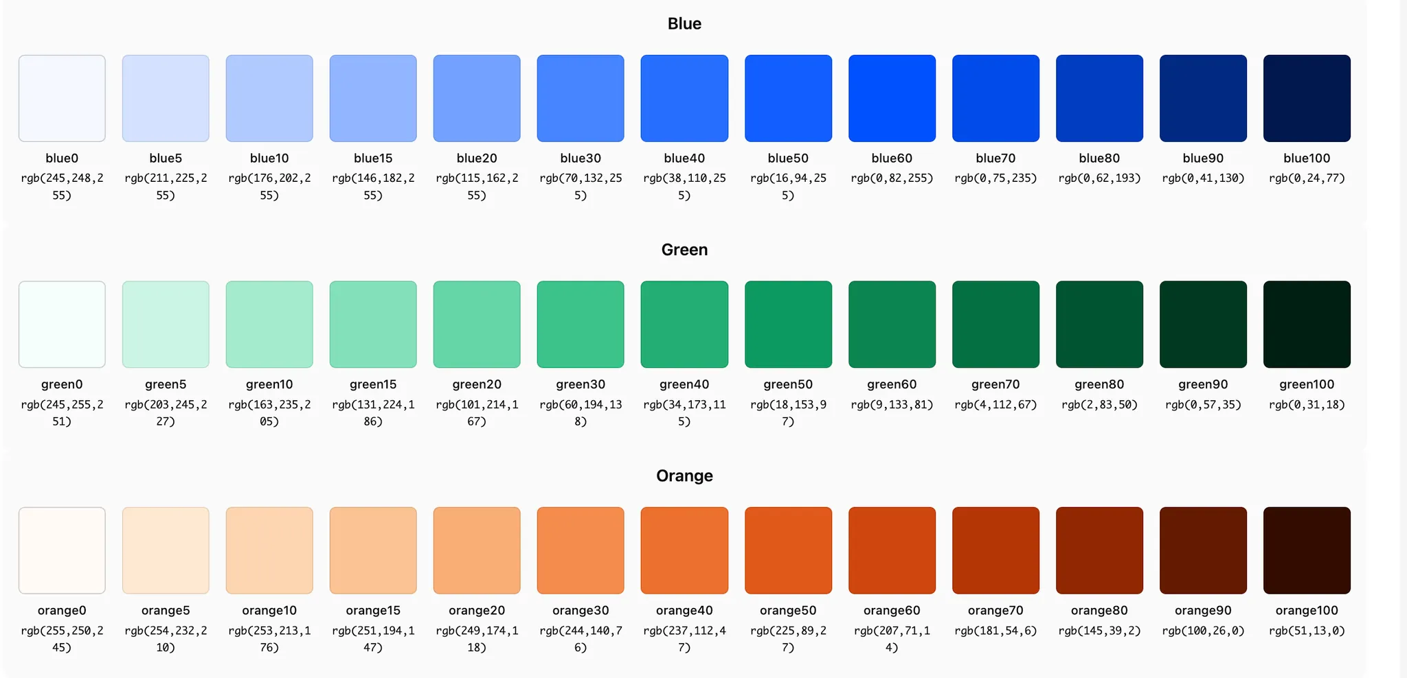
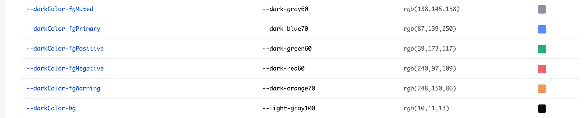
Conversely, semantic tokens define usage rules and meaning. Tokens like fgPrimary have the role of text color representing brand or main actions, with the actual color value being unimportant. This causes component level to use only meaning-based tokens without directly referencing specific color values.
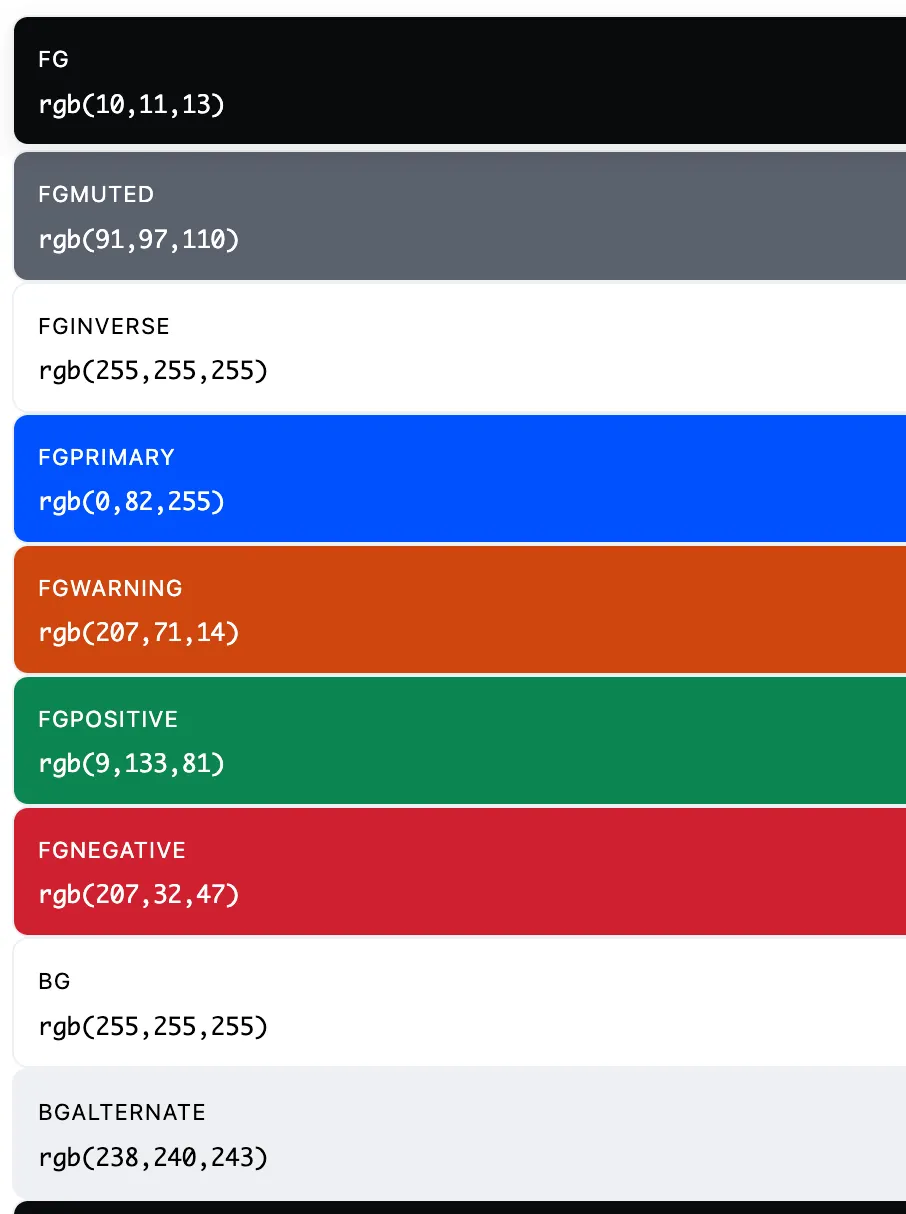
Through a simple script verifying token structure, a total of 110 semantic tokens across Light and Dark were constructed based on primitive tokens. For example, --lightColor-bg and --darkColor-bg both have the same meaning of basic background but connect to different primitive values. This structure enables responding at token level without component modifications when adding new modes or expanding themes. Theme expansion becomes data replacement work rather than UI modification work.
Token Application Beyond Color
This combined structure applies equally to areas beyond color. Spacing tokens center on 8px-based scale while using auxiliary units like 2px, 4px, 6px, 12px together. It’s a structure where fixed grid and fine adjustment are simultaneously possible.
Typography appears as one of the most refined areas in this theme. Font family, size, weight, line-height, and transform are each managed as separated tokens, with clear hierarchy of Display, Title, Headline, Body, Label, Caption, Legal. Mono series for data and financial UI are also separately defined. Role-based naming already applied like fontFamily-display, fontSize-title, lineHeight-body raises structural completeness.
However, Typography likewise doesn’t have semantic override structure separated by Light and Dark like color. Contrast strategies for label or caption in dark mode don’t reveal at token level.
Shadow Structure
Shadow defines only two stages: elevation1, elevation2. Design intent to limit excessive three-dimensional effects in high information density financial·trading UI reads clearly. However, it’s distant from multilayer shadow expressions frequently used in recent UI trends.
Conclusion
Coinbase Design System prioritizes tokens and structure over components, treating UI as a collection of data and rules rather than visual deliverables. Components were treated as results laid on top of tokens and logic rather than visual deliverables. Through this approach, intent to simultaneously secure implementation efficiency and scalability through the design system was reflected throughout the structure. What choices were made to simultaneously handle stability and scalability within the financial product domain also revealed relatively clearly.