![[Quest] Escape the Terms of Service Swamp: 10 UX Boss Monsters](/260209/1.webp)
Introduction
“Agreeee” (I Want to Agree to the Terms of Service) is an indie game developed in Japan that was released on Steam in December 2025, gaining explosive popularity among streamers domestically and abroad. This game appears simple on the surface. Users just need to press the ‘Agree’ button to 12 articles of terms of service. But the process is far from simple. Over 100 mini-games appear randomly, each interfering with users in every way possible. Buttons change position right before clicking, fake popups fill the screen, and pressing ‘Disagree’ even once resets everything.
What makes this game special is that while perfectly recreating Windows XP’s Luna theme UI, it extremely satirizes the dark patterns we face daily. In actual services, companies design information structures hoping users quickly skip terms. This game creates the opposite situation, paradoxically revealing how much UX can induce ‘designed behavior.’ Jon Yablonski’s textbook ‘10 Psychology Laws of UX/UI’ is difficult to examine one by one in practice. But through extremified cases like this game, we can observe how each law operates and how it can be abused.
Jon Yablonski’s ‘10 Psychology Laws of UX/UI’, like a textbook of user experience design, isn’t easy to examine one by one in practice. But the game “Agreeee” shows all these laws as extremified cases, becoming vivid educational material that sticks in your head. The reason for connecting this game to UX is clear. When designing information structure, at the corporate level, terms of service are designed hoping users quickly skip over them. The goal is to make users press ‘Agree’ with one click without scrolling. But this game is the opposite. The simple act of ‘agreeing’ becomes hours of ordeal.
This game paradoxically reveals how much UX can induce ‘designed behavior.’ Ethical traps hide within interfaces and choice structures users commonly overlook. Large ‘Agree’ buttons and small ‘Decline’ buttons, hidden subscription cancellation links, complicated settings menus all guide users in specific directions. This game amplifies such dark patterns 100 times, making us realize how often we’re manipulated daily. The anger and frustration felt playing the game is essentially the same as what we feel in actual services. Just a difference of degree.
In this article, I briefly introduce what each principle is, examine (infuriating) screens in the game, and identify which principles were technically followed and which were intentionally satirized. From Pareto Principle to Law of Closure, let’s examine together how 10 psychology laws can transform from tools helping users to weapons of torture. And in the process, we can paradoxically learn what good UX is.
Main Content
Pareto Principle
80% of total results come from 20% of core elements. In UX design, this means users frequently use only some core functions among all functions. Placing core tools like ‘Select’, ‘Frame’, ‘Text’ in the most visible places in Figma is a good example.
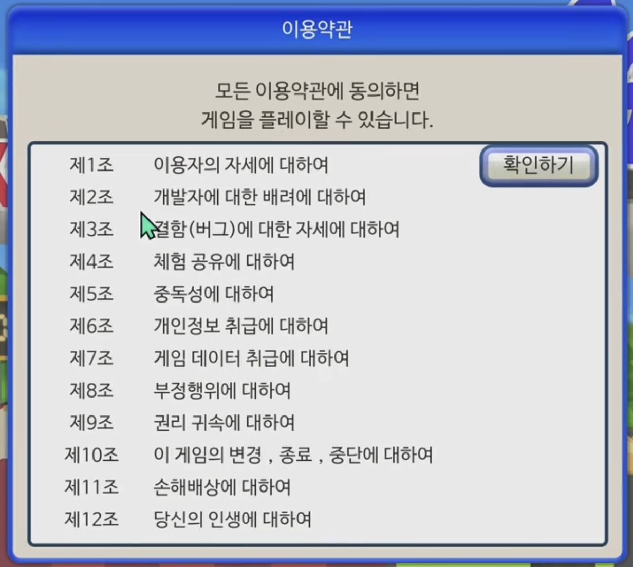
Early in the game, players face a window titled ‘Terms of Service.’ On screen, 12 terms items from Article 1 to Article 12 are listed, with guidance stating ‘You can play the game if you agree to all terms of service.’ On the right, only a single ‘Confirm’ button sits there. In this game, Pareto Principle satire hides within the ’terms agreement’ format. In reality, terms of service are just legal requirements, distant from core functions users actually want (using the service). But companies place this formal procedure before users as if it’s core.
This game maximizes that irony. The ‘formality’ of terms agreement becomes the game’s entirety. The ’thrilling action game’ users really want to play gets pushed back, and terms agreement that should originally take 5 seconds becomes hours of ordeal. This satirizes situations where secondary things (terms, newsletter subscriptions, surveys for recommendation algorithms, etc.) are excessively emphasized in actual UX, interfering with core experiences. In actual services, if signing up requires going through dozens of steps like email verification, phone verification, identity confirmation, five-page terms agreement, profile photo upload, selecting 10 interests, etc., it makes users pour more energy into secondary procedures than the core (using the service). Pareto Principle says let users spend 80% of time on 20% of core functions, but bad UX forces the opposite.
Fitts’s Law
The shorter the distance to the target and the larger its size, the faster the click speed. iOS placing bottom tab menus large in places easily reached by thumbs is a good example following this law.
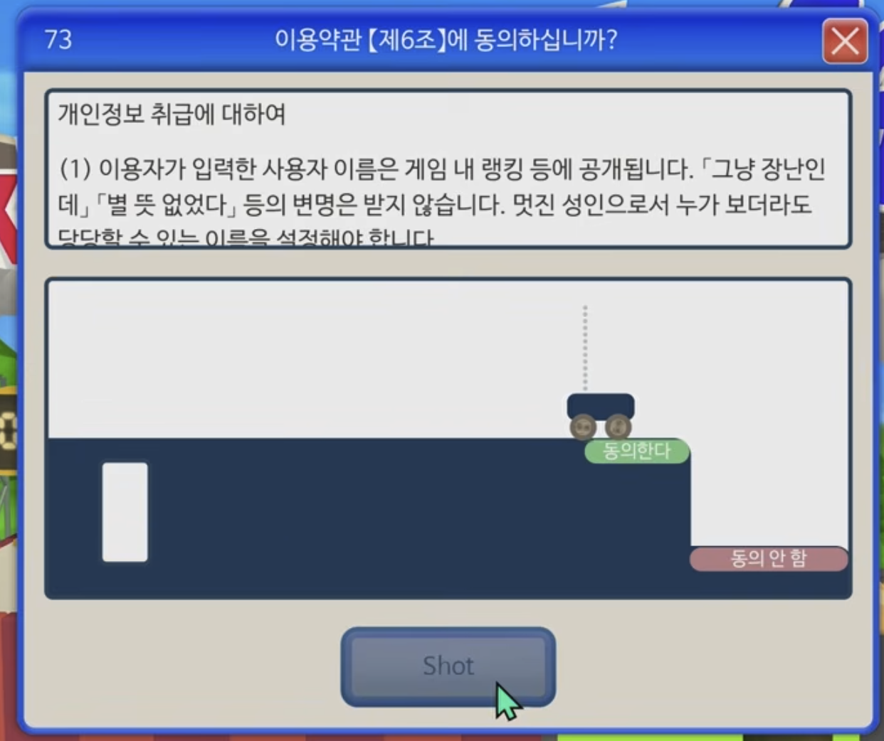
Article 6 screen is a representative case frontally violating Fitts’s Law. In the upper right of the screen is a small car with an ‘Agree’ button, and players must shoot balls with the ‘Shot’ button to hit this button. The button moves, angles must be calculated, and even physics laws must be considered. This situation of needing to hit a small moving target rather than clicking a large stationary button is the exact opposite of ‘accessibility’ Fitts’s Law speaks of. Rather than reading terms about personal information handling, users must understand physics engines and calculate ball trajectories.
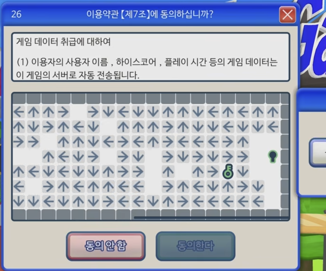
Variations are more vicious. Article 7’s arrow maze game is representative. The screen is densely filled with hundreds of directional arrows (↑↓←→), with a small key icon marked as the goal in the upper right. Users must start from the starting point (green circle) in the lower left, reverse-tracking arrow directions to find the path to the key. The problem is reaching this key itself requires tremendous cognitive distance. Fitts’s Law includes not just physical distance but cognitive distance. The target (key) is visually visible, but to actually reach there requires solving the maze by reversely following dozens of arrows. Moreover, arrows are small and high density, making each one difficult to accurately recognize.
Such patterns exist in the real world too. In cookie consent popups, ‘Reject All’ buttons are small and hidden in multi-level menus, while ‘Accept All’ buttons are large and placed in immediately accessible locations. Unsubscribe buttons are hidden in small text at page bottoms, reachable only through complex paths like ‘Customer Service → My Account → Subscription Management → Cancel.’
Miller’s Law
Humans can only hold about 7±2 items in short-term memory. This means menu items, lists, filters, etc., should be clustered to reduce cognitive burden.
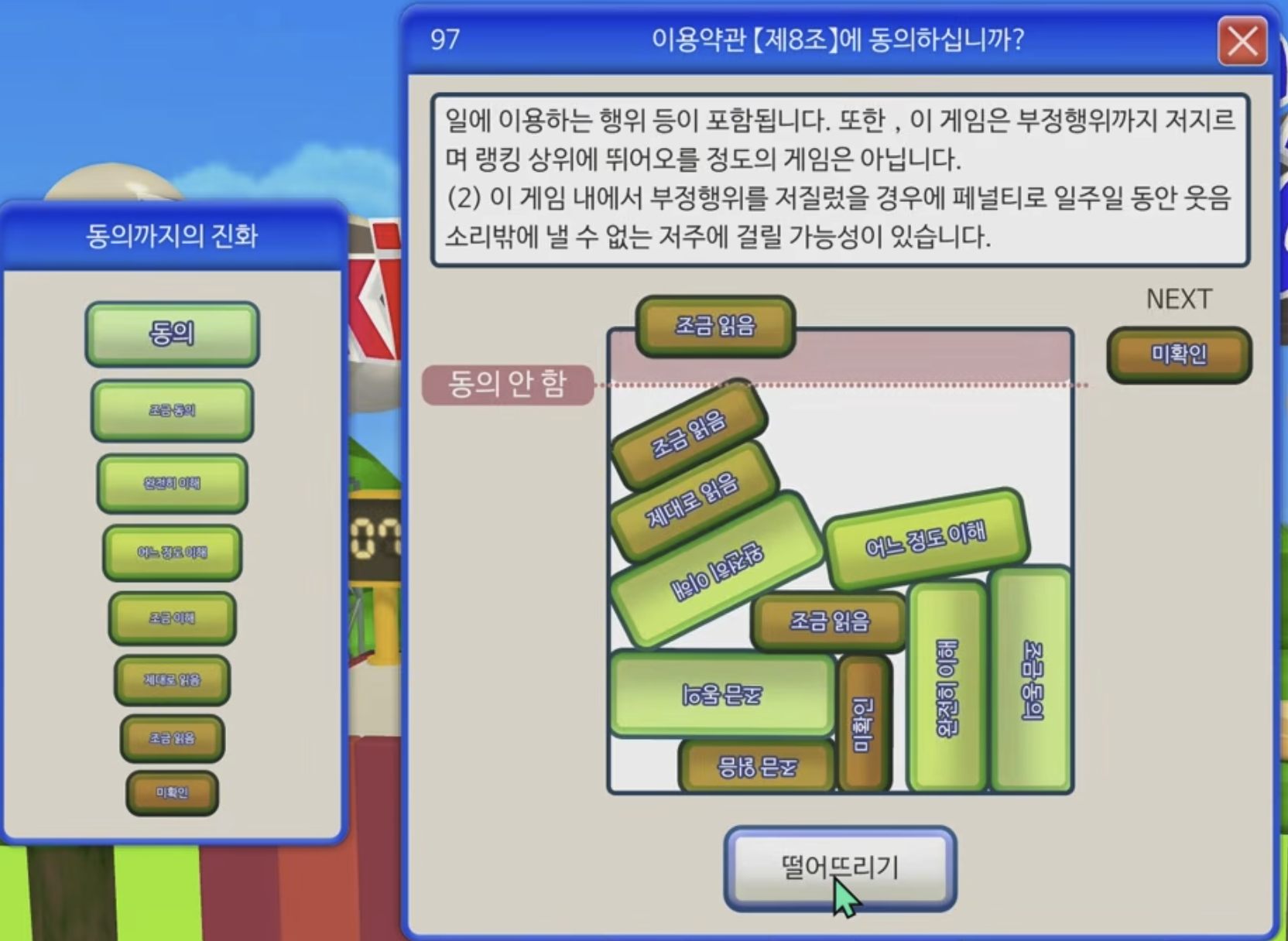
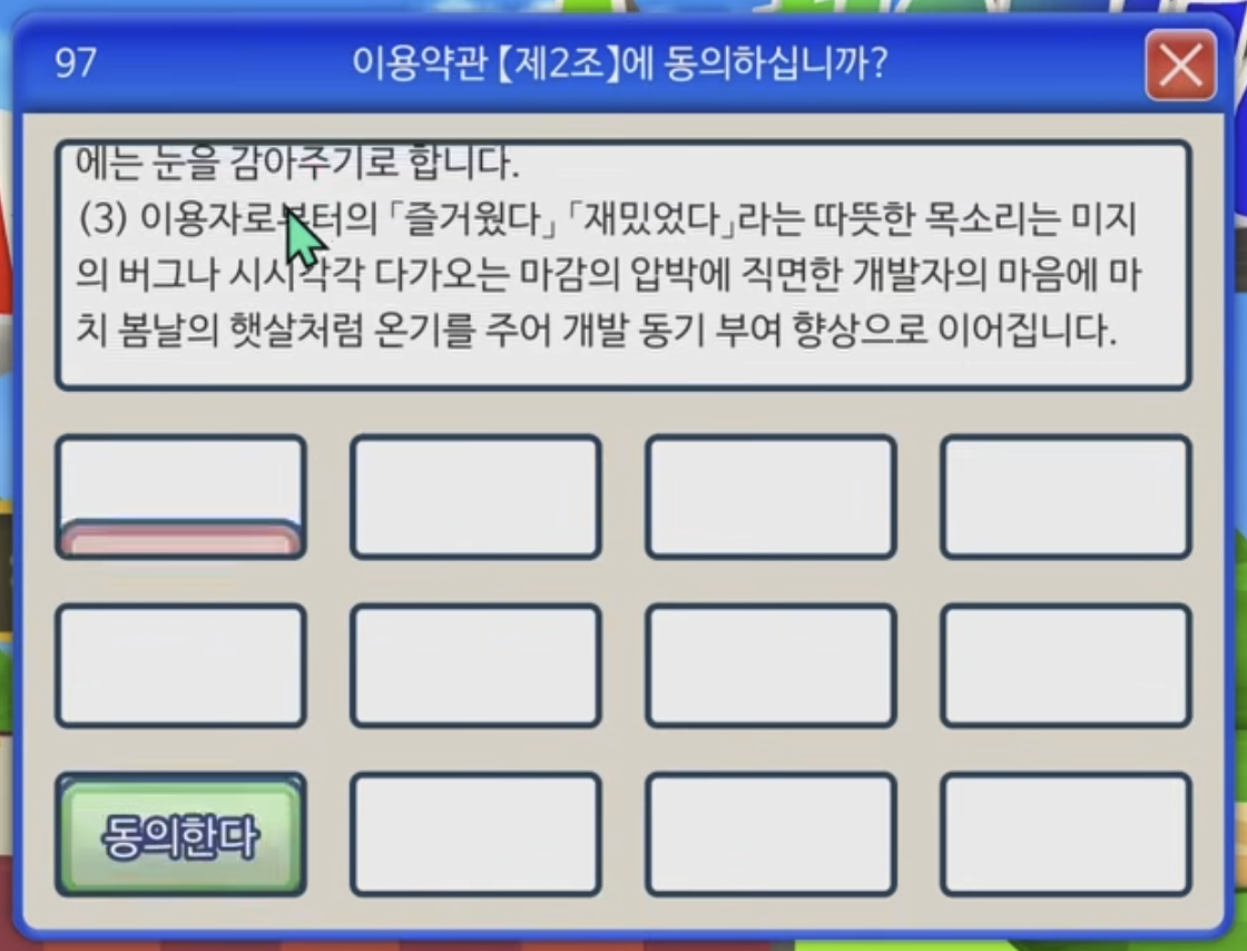
Article 8 screen frontally attacks Miller’s Law. On the left, a total of 8 evolution stages are listed vertically: ‘Unconfirmed, Read a Little, Read Properly … Agree a Little, Agree.’ This is a structure moving upward sequentially like Suika Game’s evolution system. On the right, blocks corresponding to these 8 stages are randomly stacked in various sizes and colors with text. Each block has gradients changing from green to yellow to orange visually hinting at evolution stages, but actually knowing which block is which stage requires reading text one by one. Users must remember the 8-stage system on the left while simultaneously matching which stage each of the 10+ blocks on the right corresponds to. This far exceeds short-term memory’s limit of 7±2 items, adding the cognitive burden of constantly shifting gaze between two areas contrasting information.
Hick’s Law
The more choices, the longer the decision time. This is why Google’s main screen is simple. Numerous functions are hidden inside the ‘Apps Menu’ button, showing only core on the initial screen.
Article 2’s whack-a-mole game combines Hick’s Law with time pressure. On screen, 3x4 total 12 empty spaces are arranged in a grid, with ‘Agree’ buttons appearing and disappearing at random positions. The trap button slightly visible in pink in the first cell of the lower left, and the green ‘Agree’ button is in the first cell of the third row lower left. The problem is as the game progresses, identical ‘Agree’ buttons can appear simultaneously in multiple cells.
Users must watch all 12 empty cells while deciding which of the momentarily appearing buttons is real and which to click first. While Hick’s Law addresses static choices, this game adds time pressure by adding choices that dynamically appear and disappear. When multiple ‘Agrees’ appear simultaneously, users must decide ‘which to click?’ within extremely short time, increasing the likelihood of decision errors in this process.
In reality too, excessive choices paralyze users. Hundreds of options in settings screens, shopping sites’ complex filters all cause choice fatigue. But this game goes one step further, forcing choices to be processed within time limits, pressing the ‘decision time increase’ Hick’s Law speaks of to extremes.
Jakob’s Law
People expect things to work in familiar ways. This is why predictability is more important than originality in UX.
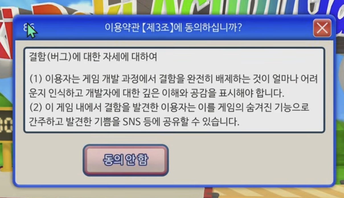
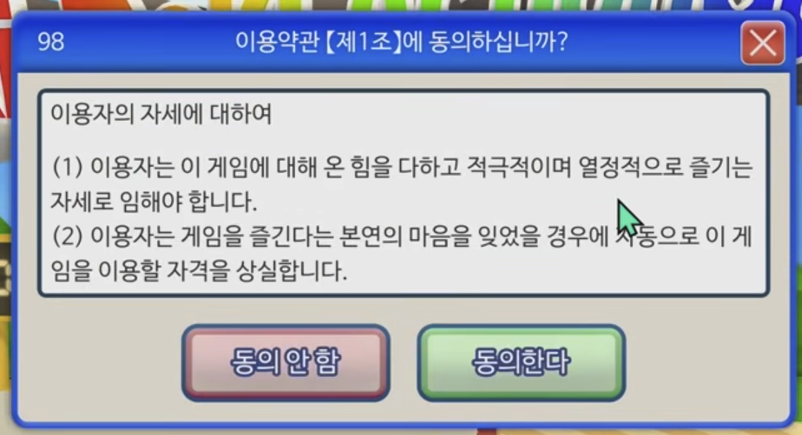
Article 3 screen most cunningly betrays Jakob’s Law. In this article dealing with attitudes toward defects (bugs), only one button exists on screen. A pink ‘Disagree’ button. Users naturally expect an ‘Agree’ button to also exist somewhere. Because all dialog boxes had pairs like ‘Yes/No’, ‘OK/Cancel’, ‘Agree/Disagree.’ But this screen only has ‘Disagree.’ Click it? Start from the beginning. The answer is waiting without pressing any button. It completely ignores the learned behavior pattern that buttons should be pressed when present.
The entire game using Windows XP Luna theme is the same strategy. Blue title bar, round-cornered buttons, familiar fonts and colors are all that interface we experienced in the 2000s. In Article 2’s variation screen, two buttons are both ‘Disagree,’ but one is green. We trust color coding that green is positive, pink is negative, but this game betrays that trust. In reality too, things that look like hamburger menus but perform different functions, or blue links that aren’t clickable confuse users.
Tesler’s Law

All systems have complexity, and someone must necessarily handle it. Good UX doesn’t force too many decisions on users and provides reasonable defaults.
Article 7’s maze game most clearly shows Tesler’s Law. The screen is filled with numerous arrows (↑↓←→), and users must find the path from the starting point (green circle) to the key (goal). The system only says ‘Follow the path,’ not telling which arrows are the correct path, how many turns to make, or in what order to follow. Users must trace each arrow individually, reverse-calculating the path.
It’s hard to say complexity designed as part of content transferred developer complexity to users. In reality, there are patterns more complex than games—software forcing all settings on users without defaults, address entry forms without autocomplete, excessive password requirements, etc. Rather, this game’s information structure itself is in the form of continuous modal windows, simpler than pages created to achieve goals on the web.
Doherty Threshold
If system response speed is within 400ms, users can be immersed. YouTube immediately playing previews when hovering over video thumbnails is an example utilizing this law.
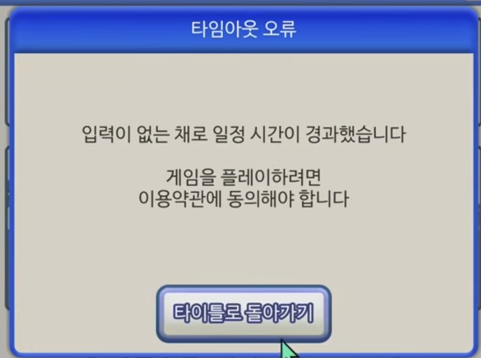
This game’s response speed is perfect. Button clicks respond immediately, mini-games load without delay, and popups appear instantaneously. Technically it perfectly complies with Doherty Threshold. The problem is this fast responsiveness is used not to help users but to interfere. The timeout error screen symbolically shows this. With the message ‘A certain time has passed without input,’ it informs ‘You must agree to terms of service to play the game.’ While users ponder, time passes, and after a certain time immediately returns to the beginning. It demands fast response while not giving time to think.
In Article 3’s popup bomb, when dozens of buttons cover the screen, these popups appear immediately without delay. Without time for users to defend, within 400ms the screen fills with buttons. In Article 2’s whack-a-mole game, the moment users find and click the ‘Agree’ button, the button immediately moves to another position. Because there’s no delay at all, users mistake they clicked the button but actually clicked empty space. In physics engine games, balls fly in real-time and cars respond immediately. All this fast response doesn’t forgive user mistakes. In reality too, ad banners that change position right before clicking, CLS where layout suddenly changes while loading, too-fast auto-refresh are examples of misusing speed.
Von Restorff Effect
Visually prominent items are better remembered. CTA buttons or warning messages should be designed to stand out.
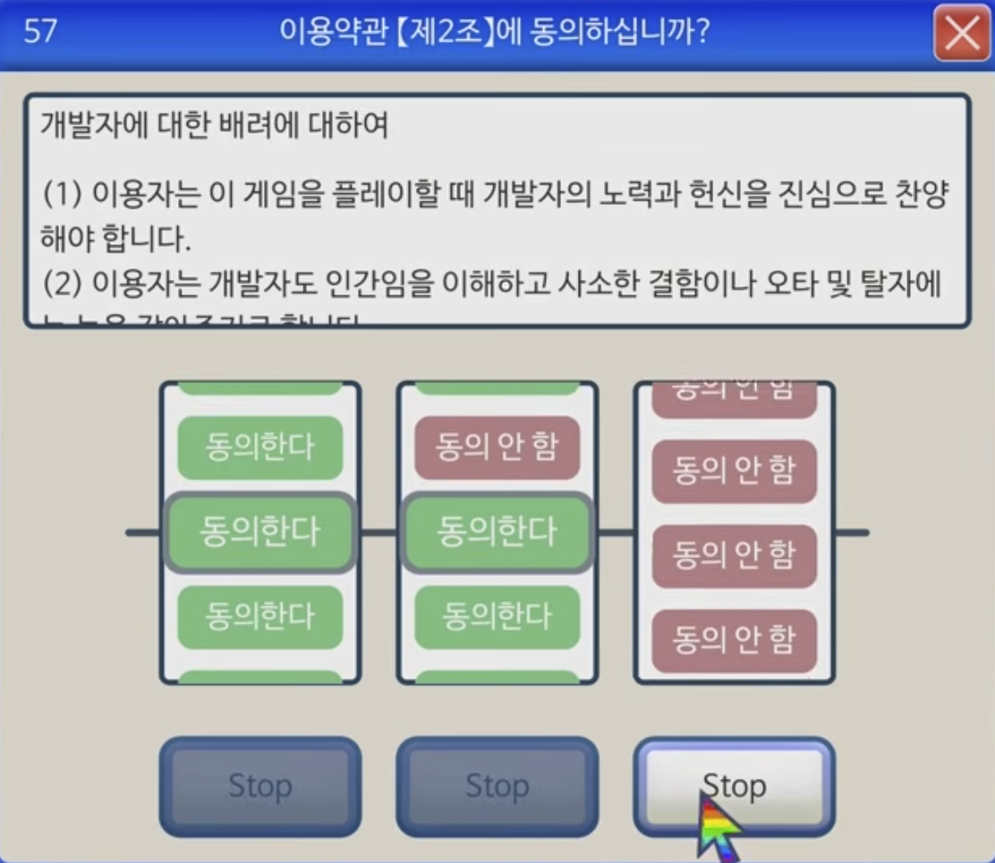
Article 2’s slot machine game cunningly reverse-uses the Von Restorff Effect. There are three reels, each alternately showing green ‘Agree’ and pink ‘Disagree’ buttons. Users’ eyes naturally go to green buttons. Because green has been learned to mean ‘positive,’ ‘proceed,’ ‘confirm.’ But in this game, all three reels must match green ‘Agree,’ which depends purely on luck. What stands out (green) is the correct answer, but it can’t be obtained. Visual emphasis rather increases user frustration. The three ‘Stop’ buttons at the bottom all look identical, with no visual cues about which to press first.
Aesthetic-Usability Effect
Beautiful interfaces feel more usable. High-quality visual style enhances user trust and satisfaction. From Article 1 screen, Windows XP’s Luna theme is perfectly recreated. Blue gradient title bar, round-cornered buttons, soft shadow effects, even system fonts all evoke nostalgia. Terms text ‘Regarding User Attitude’ is also neatly aligned, and bottom ‘Disagree’ (pink) and ‘Agree’ (green) buttons are clearly distinguished.
Faded pink and green buttons and outlined areas evoke Japanese-style design.
Law of Closure
People tend to perceive incomplete forms as complete forms. UI components can be designed to be inferable with minimal lines and forms. Even when some lines are omitted from icons, users intuitively recognize them as buttons, cards, checkboxes, etc.
Article 5’s horizontal carousel button cunningly abuses the Law of Closure. At the bottom of the screen, ‘Agree’ (green) and ‘Disagree’ (pink) buttons are horizontally arranged, with buttons at the left and right ends only half visible with the rest cut off outside the screen. Green ‘Agree’ is half-visible at the left end, then pink ‘Disagree,’ another pink ‘Disagree,’ and another ‘Agree…’ button half-cut at the right end. The human brain automatically completes these cut forms. ‘Ah, there are more buttons left and right. The rest will be visible if I scroll.’ Users naturally expect to be able to scroll left and right, predicting ‘Agree’ buttons will appear more in the continuation of cut buttons. According to the Law of Closure, incomplete visual information (half-cut buttons) is recognized as a complete pattern (continuing button list).
Conclusion
Paradoxically, precisely thanks to this extreme satire, we can clearly learn what good UX is. First, UX laws are double-edged swords. The same law can be used for both good and bad purposes. Second, dark patterns exist in reality. The extreme cases this game showed appear in subtle forms in actual services. Third, designers have ethical responsibility. They should help users, not manipulate them.
Next time you see an ‘Do you agree to the terms of service?’ popup, this game will come to mind. Is the ‘Agree’ button big enough? Can it be easily found? Is there intent to make you accidentally press ‘Disagree’? Everything this game showed extremely actually exists in subtle forms around us.
Copyright Notice
━━━━━━━━━━━━━━━━━━━━━━━━━━━━━━━━━━
Game screenshots used in this document are excerpted from the game ‘Agreeee (利用規約に同意したい / I Want to Agree to the Terms of Service)’ for educational and UX/UI analysis purposes.
Game Copyright: © 2025 All rights reserved by the original game developer Steam: https://store.steampowered.com/app/3757210
This document was created for non-profit educational purposes, and all game images and content copyrights belong to the original copyright holder. If the content of this document is judged to infringe the copyright holder’s rights, the relevant content will be immediately deleted.